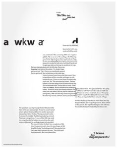
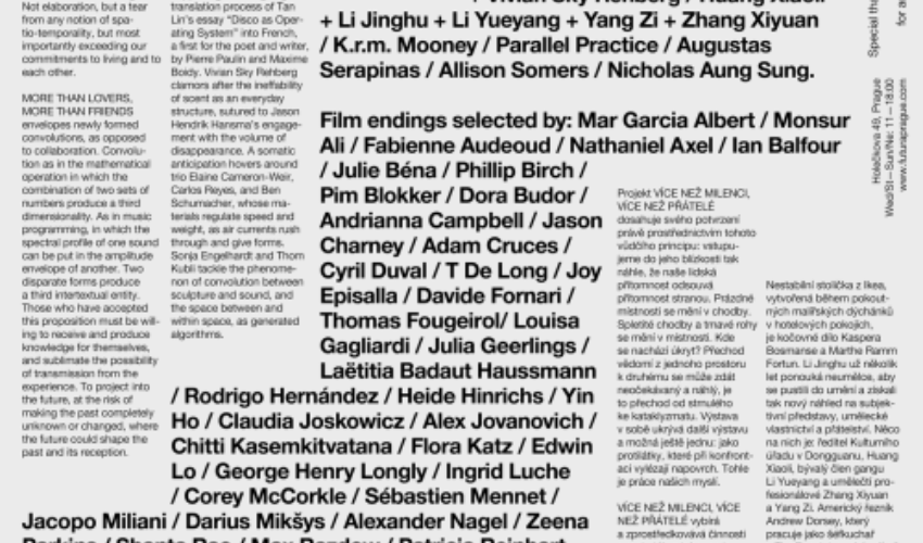
Different Types of Typesetting: Understanding Good and Bad Typesetting
The practise of typesetting is essential in the fields of design and publishing. It entails setting up and formatting material in a way that is both aesthetically pleasing and readable. While poor typesetting can impede comprehension and engagement, good typography improves the overall reading experience.
Let’s examine several various typesetting styles and what makes them effective or ineffective.
1. Traditional Typesetting
The manual procedure of placing metal or wooden blocks to form printed text is known as traditional typesetting. It takes a lot of finesse and skill to use this strategy. Traditional typesetting has a certain aesthetic appeal and allows for layout customization. However, it takes a lot of time and is less adaptable when making modifications.

2. Digital Typesetting
By utilising software to organise and format text, digital typesetting completely changed the publishing industry. Compared to more conventional approaches, it provides more flexibility and simplicity of editing. Designers might experiment with various fonts, sizes, and spacing when typesetting documents digitally in order to get the desired visual effect. Additionally, it enables greater precision and consistency across a variety of platforms and devices.
3. Responsive Typesetting
The use of responsive typesetting has become crucial in the mobile device era. It entails creating text that can adjust to various screen orientations and sizes. Regardless of the device being used, effective responsive typesetting guarantees readability and upholds the overall aesthetic integrity. The reading experience is optimised for all users by taking into account elements like font size, line length, and spacing.
Good typesetting practices include:
Choosing appropriate fonts: Selecting legible and visually appealing fonts that complement the content.
Establishing hierarchy: Utilizing typographic elements such as headings, subheadings, and body text to guide readers through the information hierarchy.
Balancing white space: Leaving enough white space around text to improve readability and overall visual appeal.
Consistency: Maintaining a consistent style throughout the document, including font sizes, line spacing, and alignment.

On the other hand, bad typesetting can lead to a poor reading experience.
Some common mistakes include:
Poor font choices: Using overly decorative or illegible fonts that make reading difficult.
Inconsistent formatting: Inconsistencies in font sizes, styles, and spacing can confuse readers and disrupt the flow of information.
Tight or loose spacing: Insufficient or excessive spacing between letters, words, and lines can make the text challenging to read.
Lack of alignment: Text that is not properly aligned can appear sloppy and unprofessional.

Effective typesetting improves text’s legibility and aesthetic appeal, whereas poor typography can make reading less enjoyable. Effective typesetting involves making proper font selections, creating hierarchy, balancing white space, and upholding consistency. Designers now have more tools at their disposal to produce publications that are both aesthetically pleasing and user-friendly thanks to the growth of digital and responsive typesetting. We can make sure that our material is interesting and accessible to all by knowing the rules and tricks of proper typesetting.


Leave a Reply